![[ + ]](plus.gif)
![[ - ]](minus.gif)
![[ / ]](divide.gif)
![[ 0 ]](zero.gif)
![[ 1 ]](identity.gif)

Erwin Redl (www) / Parallel Doubt on the Distinction Between Truth and Beauty
|
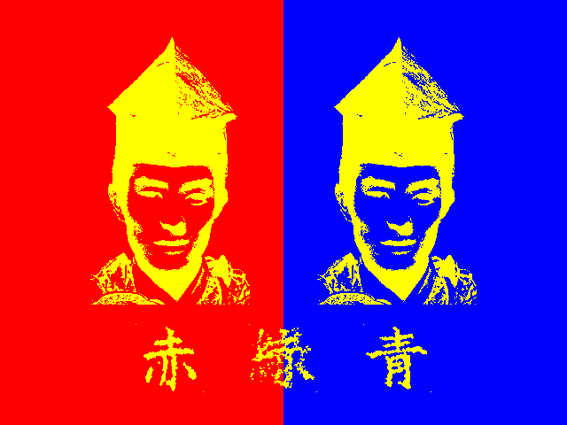
This work deals with the different aspects of visual and acoustic
perception and the relation between light (-waves) and sound
(-waves). Another level, which goes beyond this phenomenological
surface, is about the connotations of symbols, the Japanese words,
as well as the emotional meaning of a severe and a laughing face.
All changes occur very slowly, almost unrecognizably -- a challenge for an audience used to a very short span of attention. The focus is on the other side of the new digital media: slowness and subtlety. Long durations are no longer a question of storage space because the actual program code takes up (almost) no memory. With a minimum of digitized audio-visual data (samples, scans) and changes exclusively generated by various algorithms the 'human' ways of sensual perception of time experience an almost unlimited expansion. Two slow-motion animations, each of them with split-screen esthetic, on two monitors at the opposite walls and four interleaved audio channels, provide the environment for intensified vigilance. The visual starting point are the primary colors red, green and blue. Smooth transitions between these colors define the thresholds of the perception of contrasts: light-dark, background-foreground and the borderlines of the colors. At the same time two face portraits of the Japanese actor Kazuo Funaki, a smiling one and a severe one in the center of the picture, begin to change their emotional expression. The smiling face becomes the severe face and vice versa. The background colors, one for the left and one for the right face, and the foreground color of the faces determine the appearance of the three Japanese characters for 'red' (akai), 'green' (midori) and 'blue' (aoi) in the lower left, center and right region of the screen. The color of the Japanese letters is the same as the color of the faces and has to be different from their representing linguistic meaning of the words, otherwise it would be impossible to see them, because of a lack of contrast to the background -- there is no way to escape the difference between visual appearance and linguistic meaning. The acoustic part of this work is directly linked to the visual part -- a strict concept lays down the execution by the two media. Both media can be measured and compared in terms of their specific wavelength. The direct relationship is laid down in my theory of 'Parallel Media'. The color 'red' corresponds to the tone 'g', the color 'green' to the tone 'c' and the color 'blue' to the tone 'f'. Similar to the smooth color transitions all changes in pitch are glissandi. Our sense of hearing has to find out the exact intersections of the different up and down glissandi and the different levels of musical harmonies and intervals.
|